Creating powerful calls to action that readers can’t resist
Just do it.
It’s a famous slogan and we all know to whom it belongs. But it’s also one of pop culture’s most pervasive calls to action.
Just do it.
Life’s short, the sportswear giant intones. You – the consumer – need to take action. Now.
Adverb, verb, pronoun. It’s a simple sequence but it holds a staggering amount of power. After reading, you’re suddenly compelled to perceive life in motion; kinetic energy lights up the copy, and its immediacy urges you to do it.
What is it? In this instance, it’s purchasing a pair of sneakers or running shoes or shorts, which in turn promise the consumer a secondary it: achieving their goals, getting into better shape, feeling desired.
A lot’s packed into those three little words. But that’s why we’ve all heard them.
Indeed, an effective call to action is a necessary part of a strong digital marketing strategy, and, luckily for you, this guide will explain why.
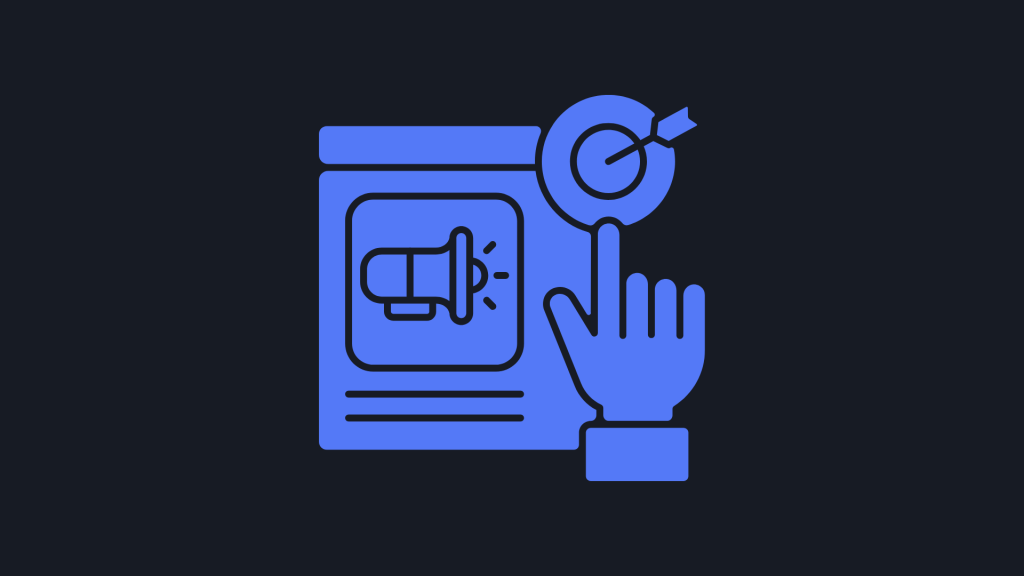
What is a call to action?
A call to action (or CTA) is typically a verb-loaded phrase or text prompt that seeks to invoke a change in consumer or reader behavior. Usually part of a marketing campaign, or perhaps embedded within a company’s landing page, the text – by way of creating a feeling of necessity or a fear of missing out (FOMO) – compels the reader to click.
We know call to action’s meaning, but what does it look like?
CTAs can be formatted as buttons (a phrase entices you to click and takes you to the next page, bringing the user further along their journey), forms (an exchange of information for a promised service or incentive), and social media pop-ups (a small, visually striking window appearing at the forefront of a reader’s point-of-view).
There are plenty of other ways to format a CTA. However, without a doubt, the most important thing about them is what they say and, consequently, evoke.
Examples of calls to action
Here are some call-to-action examples from big brands that you’ve likely engaged with at some point:
Headspace – Get some Headspace
Booking.com – Find your next stay
Netflix – Join free for a month
Dropbox – Find the plan for you
What makes these calls to action so powerful? What works in the above? Is there anything that doesn’t work?
For starters, they all begin with a verb: get, find, join.
There’s a reason why you’ve heard of Booking.com and Netflix – they are market leaders, and that’s because they draw consumers in. To do so, they use kinetic language – words that evoke movement and action.
With the former, there’s also an implicit promise being made by the company: clicking the CTA button means we will find our next stay. There’s no ambiguity.
With the latter, we’re offered a promising incentive. Why wouldn’t we join for free for a month? After all, we don’t want to miss out on Stranger Things, Squid Game, and other hit Netflix Originals.
By refusing to click on these CTAs, we might miss out on a perfect holiday at a perfect price or be left out of the water cooler chat about the season finale in the office on Monday. No one wants to be left in that position – and marketers know this. In fact, they knowingly exploit it.
What Netflix is lacking (direct address/pronouns promising a tailored experience), Booking.com makes up for. Yet this allows the streaming giant to proffer an incentive that others can’t in such terse copy. We get a free trial.
Finding the right balance between these methods of persuasion is essential to creating a provocative call to action.
How to create a powerful call to action for your business
Two simple CTAs would be ‘Click here’ or ‘Buy now.’ Even simpler yet: ‘Subscribe’ or ‘Download.’ We’ve seen them a thousand times, but have we noticed them? Probably not. That’s because they typically necessitate action rather than compelling the reader to decide upon an outcome.
‘Just do it’ doesn’t suggest we stop and weigh up the pros and cons of doing it. Rather, perhaps by tapping into the psychological phenomenon we know as fight or flight, an emotional-driven motion for action takes over. We must do (or die).
If placed online, CTA buttons should appear in appropriate places that align with a user’s experience. Readers should not have to go back to a previous page to find a CTA.
There should never be preliminary work to do and the reader should never experience decision fatigue. Such experiences will only hamper conversations, whether sales, subscriptions, or click-throughs.
Popular places to include a CTA:
- Top of a webpage
- Above the fold (a newspaper term, but for Gen Z: before you begin scrolling)
- Navigation bar
- Middle of the page
- Bottom of the page
- Footer
CTAs should use strong wording that’s suitable for your brand. They should also be convenient and easily noticeable.
For that reason, a CTA should appear on the first third of a page or be otherwise placed in the navigation bar at the top of a website. In doing so, it’s there. You can’t miss it. But you can also effectively compound the effect of a CTA by having multiple buttons across or throughout a website, newsletter, or marketing campaign. So, you might include one CTA in the top navigation bar, another in the middle of the page (making sure it’s before the fold), and then a final CTA at the bottom of the page.
(Quick tip: humans typically read in a ‘Z’ shape, also known as the Gutenberg Diagram, which means, as you might expect, readers start in the top-left corner, move to the top-right, and then descend diagonally to the bottom-left, before finishing with a slide to the bottom-right.)
Digital marketing methods – unlike their analogue or print equivalents – also allow for on-the-go adaptation. Advertisers will often use the results of A/B testing, which measures the efficacy of different marketing tools, to increase click-through rates or purchases from CTAs.
For instance, it might be that you’re not tempted by Netflix’s ‘Join free for a month,’ but are instead enticed by ‘Give it a try.’ With A/B testing, then, companies can adapt CTAs in near real-time to ensure buyers progress to the next step of their journey.
Though call to actions might seem fairly simple, they can make a big difference to a reader and how many leads or purchases a business ends up receiving.
Find out how we can help you with your website and make sure your CTA buttons are best utilized.
(That was a CTA, did you notice?)
Written by Alexander Caesari.